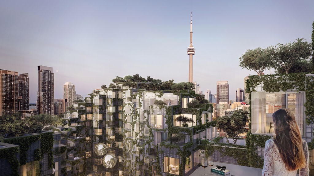
Toronto is welcoming a wave of exciting developments and the latest of these pays homage to a much earlier project in eastern Canada. Construction of a 56,000 square metre mixed-use development of condominiums and penthouses has just begun and draws its inspiration from Moshe Safdie’s Habitat 67 housing complex built for Expo 67 in Montreal.
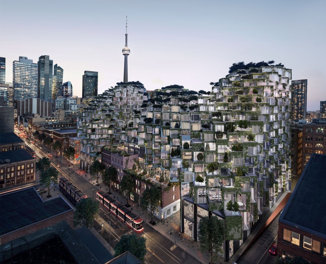
The new project, called King Toronto, has been designed for developers Westbank Corp & Allied Properties by Denmark’s Bjarke Ingels Group (BIG). It will feature stepped, terraced apartments with glass-brick façades covered in vertical gardens and will occupy a city block in King West, a previously industrial neighborhood fast developing a sohisticated new identity.
Bjarke Ingels’ vision is a pixellated one, drawing inspiration from Habitat 67’s tumbling boxes, but with BIG’s own distinctive signature, Mountain forms, geometric shapes and hybrid uses all feature in Ingel’s work and sustainabilty is a common theme. He likes to blur the boundaries between buildings and the natural world and it looks as if he’ll achieve that.
Ingels calls his design a “boxillated landscape”, describing it as “Habitat 2.0”. He says that he wanted to get away from the narrative he believes dominates much of Toronto.
”We asked ourselves if we could imagine an urban integrated equivalent of Safdie’s Habitat 67 half a century later,” he says. “In this revision, the street wall is broken and rotated. The monolithic volume of the tower-on-podium is chipped away to create an undulating landscape of terraces. And at every shift, an urban garden is created.”
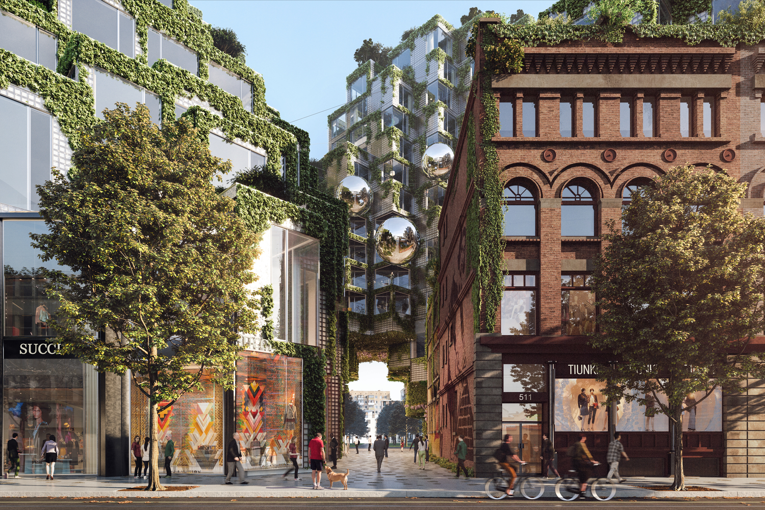
A series of peaks and valleys help light to enter the tumbling mass of building forms. The peaks frame a central courtyard opening to the street at the north and towards a new park to the south. Down at ground level, the courtyard runs up against the facades of the heritage buildings, which will hold office space and retail shops. The courtyard itself features a graphic terrazzo paving pattern, and a misting device called a ‘cloudmaker’, which uses rainwater and graywater to support the green planting.
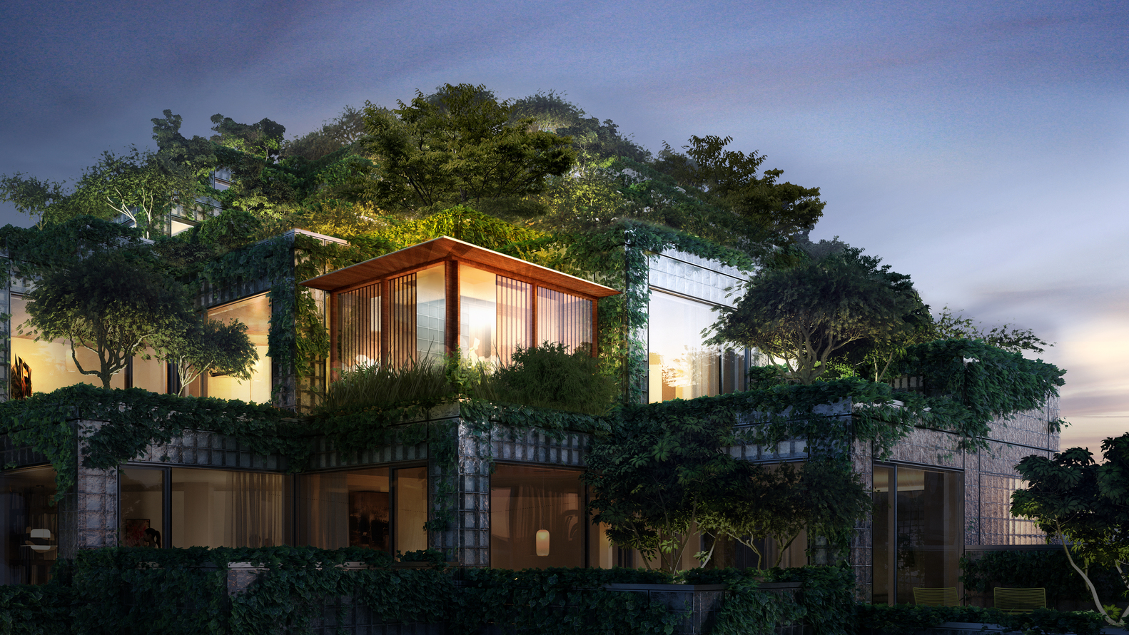
Eight penthouses crown the project, facing north, south east and west and each of the cardinal directions has a different aesthetic. North’s is industrial, taking the existing red brick buildings as a reference point. The south makes extensive use of the light offered by glass construction materials and features plentiful foliage. The penthouses in the west feature a double-storey bookcase, a spiralling staircase and a sumac tree growing inside. Finally, the eastern facing dwellings are themed for warmth and calm, supported by modernist Scandinavian design.
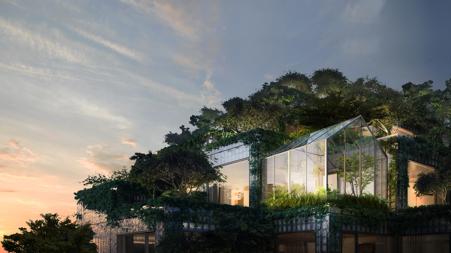
The development took two years of negotiation with city planners to ensure it respected the area’s heritage because it grows amidst four, century-old red brick buildings on the King West street front. An informal and ‘organic’ network of laneways, alleys and secret gardens creates a public plaza within the development which should hold plenty of interest.
Its also a characteristic of BIG’s architecture that the drama of the development is grounded by practical details. Each home’s floor plan is generally either square or ‘L’ shaped. Rectangular rooms are eminently sensible and leftover corners become utility spaces or corridors. Outdoor spaces are important and designed for everyone to enjoy.
Ingels claims he hates being pigeonholed by any particular style, and has been responsible for some distinctive recent projects, including a jigsaw puzzle house that can be reassembled, a Lego experience centre, a Norwegian art gallery that twists like a fanned deck of cards as it bridges a river, and a dramatic roof for Google’s Mountain View development in California.
